PROJECT DESCRIPTION
Ingenio supports Canadian laboratories (research, industrial, pharmaceutical, clinical) with cutting-edge analytical equipment and specialized services. Its mission is to create tailored solutions that help its clients transform their scientific challenges into successes.
In a strategic move to strengthen its presence and clarity in the Canadian market, Ingenio took a crucial step in developing its brand identity. The entities Phytronix Instruments and Phytronix Technologies evolved to give rise to two distinct and dynamic brands: Ingenio and Phytronix. To support this transformation, a strong and cohesive brand identity was deployed for Ingenio. This was brought to life through the creation of impactful new communication tools: two dedicated websites and distinct social media profiles. This strategy allows Ingenio to fully resonate with its target audience, affirming its unique positioning and value proposition in the scientific instrumentation landscape.
Meaning of the Logotype
The brand name, Ingenio, directly evokes the company's core values. It suggests ingenuity, intelligence, and the ability to design innovative solutions—essential qualities in the field of scientific instrumentation.
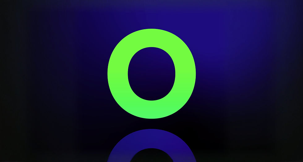
Ingenio's logotype combines a figurative symbol with refined typography to reinforce the brand's message. The central symbol represents a figure whose luminous head symbolizes knowledge, intelligence, and clarity of mind. In a scientific context, this metaphorical image evokes sharp expertise and the ability to provide enlightened solutions.
The semicircle represents guidance and support. It suggests a partnership and a willingness to be open to the client.


AGENCY
Altitude Conseil
VISUAL IDENTITY
Art Direction / Graphic Design: Django
Graphic Design: Serge Rhéaume
Brand Signature: Django
Strategy and Copywriting: Maxime Courchesne
Project Management: Georges Poulin
WEBSITE
Graphic Design and Art Direction: Django
Strategy and Copywriting: Maxime Courchesne
Project Management: Georges Poulin